
Role
User Research
Product Strategy
UI Design
Interaction Design
Usability Testing
Tools
Figjam
Notion
Maze
Figma
Dovetail
Timeline
5 weeks
The Problem
When trying to create a healthy habit and begin the Wim Hof 20-day cold water shower challenge new users are confused and are not given clear direction which results in users discontinuing the cold water shower challenge.
The Solution
To solve this problem, I made it easier and clearer for users to begin the challenge, progress through the instruction screens, configure their settings, and track their progress.

Usability Review
To help me better understand the product, I conducted a usability review to identify pain points and wow moments within the existing experience.

Business & User frustrations
Following a usability review I defined the primary and secondary business and user frustrations
Primary Frustration
When trying to begin the 20-day cold water shower challenge new users are confused and are not given clear direction which results in users discontinuing the cold water shower challenge.
Secondary Frustration
When trying to begin the 20-day cold water shower challenge new users are unmotivated and do not understand the importance of the cold water challenge which results in the users quitting the challenge before completing it.
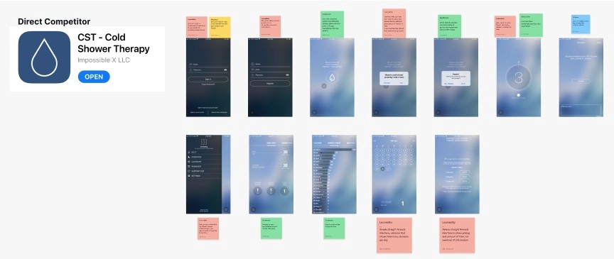
Competitor Benchmarking
I moved on to competitor benchmarking to help me identify standards in competitor products that could be used to improve the existing experience.
I analyzed the CST app which used a sleek interface with simple screens and progressive disclosure.
Problem Space
Combining my initial usability review and competitor benchmarking helped me identify the problem space within the existing experience.

How might we make it easier for new users to complete their first shower challenge?
Ideation
To avoid just following the first idea, I conducted a series of ideation techniques. This allowed me to consider an array of solutions. I mind mapped what could be improved or added to the product.

What can we add
I chose to add the ability for users to choose to play their own music during the cold water shower challenges to add a personalized touch for the users.
What can we improve
I improved the count down timer and shower timer by making the interface clearer and adding simple descriptive text. I also simplified the settings pages using progressive disclosure
User Flows
The existing user flow had a very unclear settings page with many options which overwhelms the user.
I improved the user flow by adding progressive disclosure to the settings page which simplifies the experience.


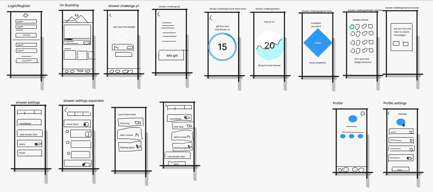
Rapid Prototyping
Having mapped an improved user flow I spent time rapidly prototyping a solution. Sketching helped me rapidly iterate on the original idea and visualize a solution without committing too early to hi-fidelity screens.
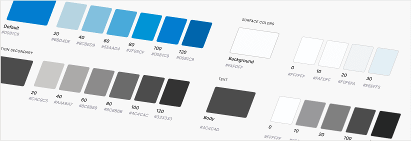
Styles & Components
Before creating the hi-fidelity prototype I defined the product styles and interactive components in Figma to easily and quickly help me design consistently

High Fidelity Prototype
Below is the final version of the prototype that I created. I included interactions and transitions from Figma to match the products flow.